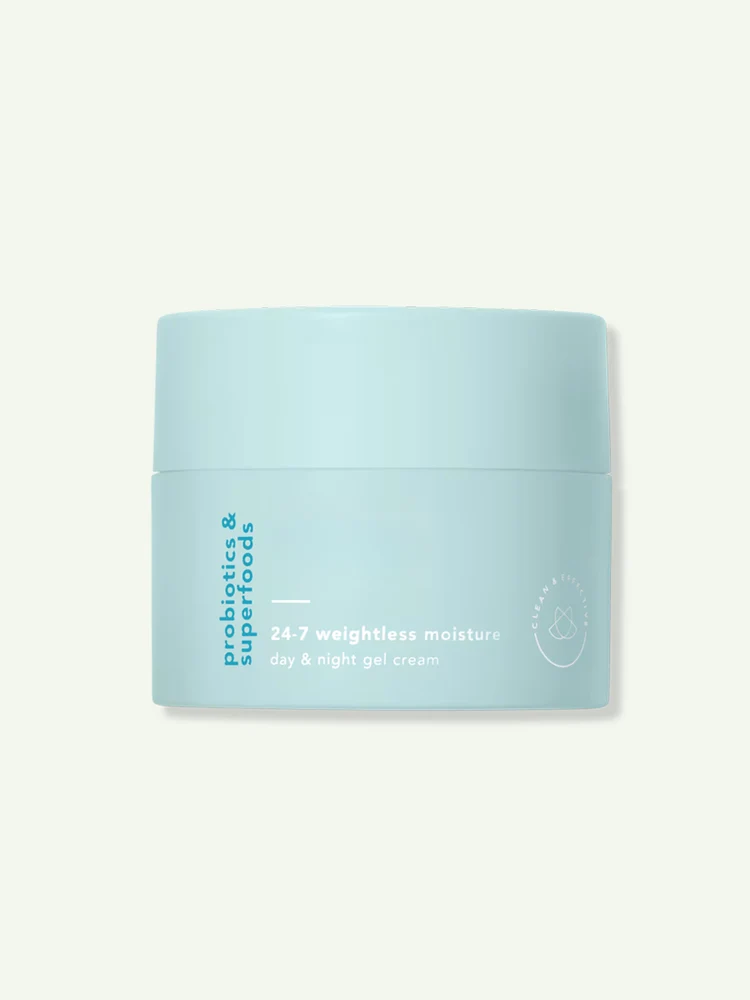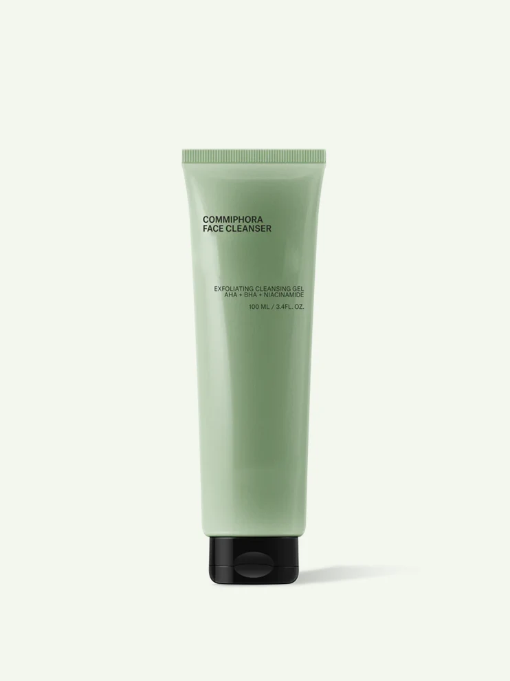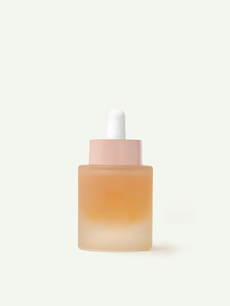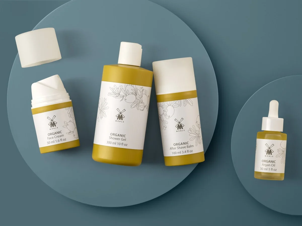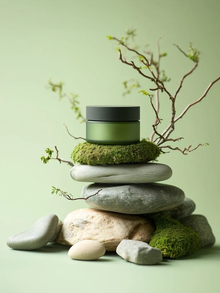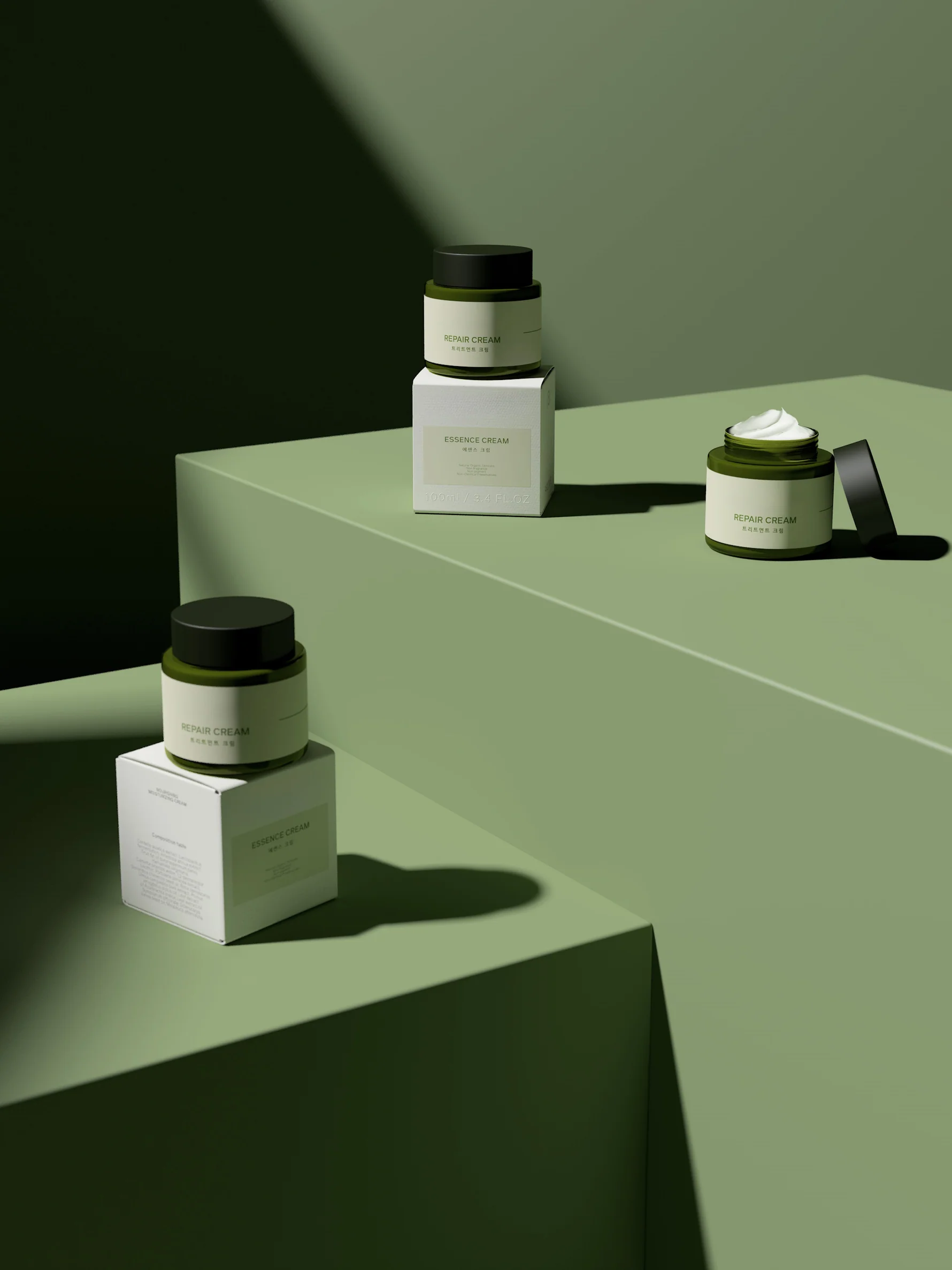
The silhouette gets your attention. The finish is often what makes you stay. This concept notebook looks at how colour and surface choices can shape the character of a packaging collection.
Describe the feeling before the finish
Start with a small set of references. Is the direction quiet and natural, polished and precise, or expressive and colourful? Describing that direction helps make later conversations about colour, decoration and surface treatment more specific.
Compare finishes on the intended material
A matte direction, a glossy surface and a translucent look can express the same colour very differently. Compare samples on the material you are considering, rather than relying only on a digital colour or a photograph.
Make space for the artwork
Consider the decoration area together with the shape of the pack. Brand marks, ingredient information and other artwork need a suitable layout and a reviewed printing or decoration method. Keep the brief open until the relevant limitations are confirmed.
Review the whole collection together
Bring the bottle, closure, jar and other formats into the same sample review. Record the reference you prefer and the questions that remain, so the next round of development starts from a shared direction.
A THOUGHT TO TAKE WITH YOU
Use physical references to align colour and finish; confirm feasibility before treating the concept as final.